
A fresh new look for the Yelp app
Yelp app redesign project (2018) - 5-week prototyping project
Yelp.com is a crowd-sourced business review and social networking site.
Why redesign
As the sole UX designer for this project, I focused on the following for the app redesign:
- User research
- Wireframes
- Design mock-up
- Usability testing
My role
During a five-week design and prototyping class I focused on identifying and improving the current Yelp app:
- Improve the existing navigation
- A visually outstanding user experience
Problems that needed to be solved
After spending sometime on the app, I noticed some opportunities for improvement:
- Navigation - finding a restaurant
- Social interaction with friends
- Advertisement placements
- Creating a review
Out of the issues I experienced, I focused on improving the navigation to find a restaurant.
User Research
I have never used the Yelp app, so I experienced the app from a new user's perspective. Once I downloaded the app and signed in, the home screen was a lot to take in: Rows of icons, an advertisement and a partial restaurant photo where all crowed into a layout above the fold. This demanded that the user had to scroll down the page to actually see nearby restaurants.
I wanted to know which categories had the most views in the app. I went online to do a little research and found https://zhiyangzeng.github.io/, which was exactly what I was looking for. The graphs and pie chart below especially stood out to me. With this information, I was able to organize my business categories from those with the most reviews to the fewest in my redesign.

Since finding a restaurant was my main focus, I wanted to dive deeper and see how Yelp laid out the copy for each restaurant profile. A few things I noticed:
- The information hierarchy was unorganized.
- What was each dollar sign worth?
- The map was crowded with restaurant locations overlapping each other.
- There wasn’t any vegan or food allergy information.
- I wrote down all of the business information that was presented on the restaurant page and the general issues I encountered using the app. I then reviewed my notes to help reorganize and lay out the information in a manner that would create a better user experience.

User task flow
With the user research I collected, I started laying down the pathway for users to find a restaurant they’ve heard about. Below are a few changes that will help users get there faster:
- Users don't have to sign in every time they enter the app if they’re not comfortable signing up.
- Location access can be turned on in seconds.
- Displays the top four business categories at your fingertips.
- Less scrolling for restaurant information.
- Voice recognition is a search option.
- Alerts to remind users of appointments and reservations.

Wireframes
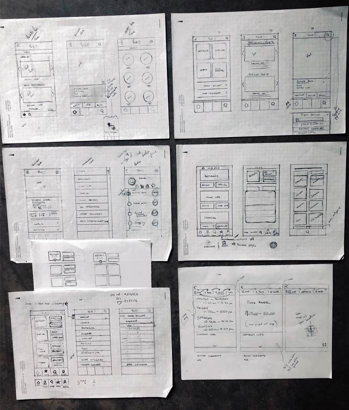
To find out how the restaurant information would be laid out, I started with a number of wireframe sketches to make my notes and findings come to life. While sketching out my wireframes, my goal was to satisfy every user with a focus on making the new Yelp app design accessible and inclusive for everyone, including users of any age and people with dietary restrictions or food allergies.
High-fidelity wireframes
Splash Page

1. User sign in
Once the user opens the app, they will have the option to continue As a Guest or Sign In. If the user chooses to enter As a Guest, they will continue to see the home screen. If the user chooses to Sign In, a splash page will appear.
Location Access

2. Location access options
Users will be able to view the location access page after they launch the app. If the user chooses Don't Allow or Maybe Later, they will have the option to set up location access within their Profile page or the next time they use the app.
Nearby Businesses

3. Finding a restaurant
If the user chooses the location access, the app will show the number of nearby businesses.
Nearby Restaurants
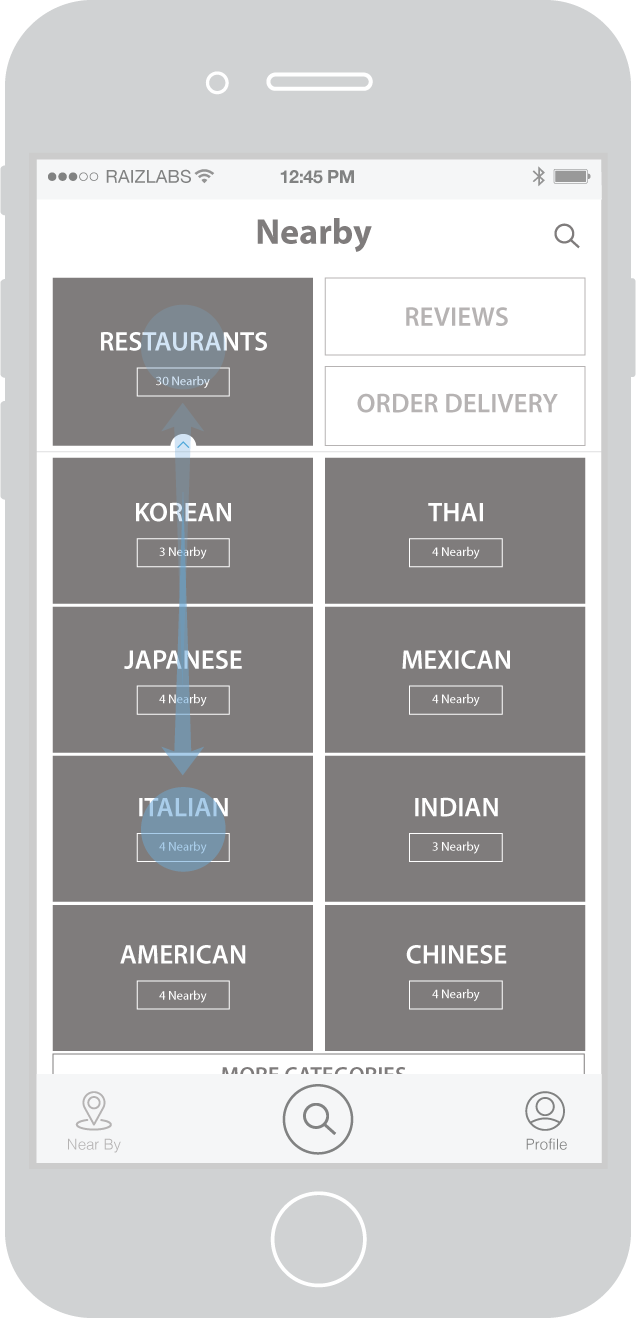
4. Choosing a restaurant
Once the user taps the restaurant photo, a drop down menu appears with nearby restaurants. Tapping the photo again will close the dropdown menu.
Restaurants (Italian)
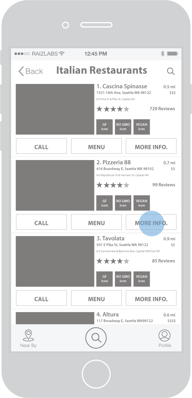
5. Selecting a specific restaurant
Once the user is on the Restaurants page they will see which restaurants are nearby and what the serving options are. Users also have the option to call the restaurant, view the menu or find out more information about the restaurant.
Restaurant Profile
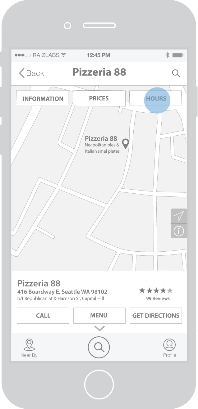
6. Pizzeria 88 profile
When the user is on a restaurant’s profile page, they are able to see the hours the restaurant is open, what the price range is, and get directions. If the user scrolls down, they will see the restaurant's URL, reviews, coupons, delivery and takeout options, amenities, payments, photos, and social media channels.
Restaurant Hours

7. Pizzeria 88 hours
By tapping on the Hours button, the restaurant’s hours are displayed. Users also have the option to call, view the menu, or get directions with the row of buttons at the bottom of the screen.
Restaurant Prices

8. Pizzeria 88 prices
The user is able to see the price range of a restaurant by tapping the Price button. If the user wants to go back to the restaurant’s profile page, all they need to do is tap the information button.
Design mock-ups
After I sketched my wireframes, they came alive in color. Using Yelp branding and remaining consistent with the website (which the current app is not), I moved forward by adding the accessibility features and elements in a hierarchical manner.
Splash Page

Location Access

Nearby Businesses

Nearby Restaurants

Restaurants (Italian)

Restaurant Profile

Restaurant Hours
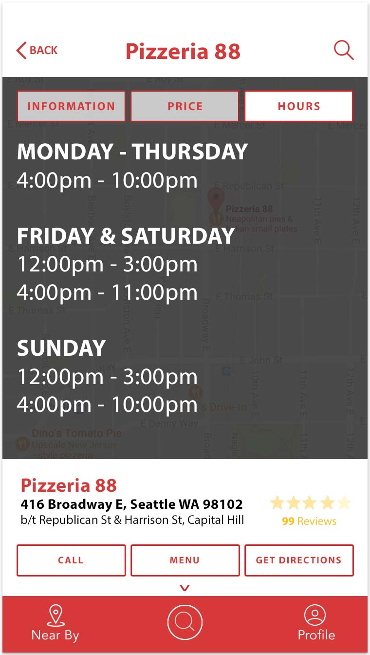
Restaurant Prices

Yelp app prototype
Usability testing
After the mock-ups were completed, I wanted to see if my homework paid off, so I worked in InVision to flesh out the mock-ups and brought my designs to life.
I came up with five questions to ask three users of different ages (30-50) to test my Yelp app redesign. Each of them had previously used the Yelp app. They used my prototype on their devices to get a sense of how my design would be presented on different smartphones.
The user testing was successful and each of them found my new navigation experience to be clear and efficient. During the user testing, the most repeated comment that came up was that the copy was too small for them to read on their smartphones.
The outcome
Results from the user testing showed that my redesigned interface made it easier to find a restaurant and the content was a lot easier to understand than the current Yelp app. The information hierarchy was organized in the page layout, dollar signs also represented price ranges, visual icons showed which restaurants catered to customers with a special diet or those with food allergies, and the new design was accessible and inclusive for everyone.
My takeaway from this project was that I am able to layout out a mobile navigation and content within five weeks as well as complete a redesign, from the initial research stage to a final visual prototype.
"I like this design better than the present Yelp app!”
Margot Bausher – Inside Sales at Talyst Systems